
Finding the 'Look'
- ollietristram
- Jun 5, 2020
- 3 min read

During the downtime created by Coronavirus (what day is it again?), I've been editing a short film, A Change in Time, which has finally reached picture-lock. It feels good to know, that all those hours put in to crafting the edit and working (remotely) with the director, it's now in a place we're both really happy with.
But it's not job done. I took on the film because it's a great showcase and potential stepping stone for me to get even more creative projects to work on as an editor, but also as a colour grading artist. So, the next step is to colour the film, and help tell the story even more through the visuals. You can't just go in blind: as with all things creative, you need to take your inspiration from somewhere, so here is my initial research into how I might grade each of the scenes and why I've chosen these looks.
There are multiple scenes across the film and each one requires it's own feeling and tone. The central theme of the film is time travel, which also opens doors to grade each of the different eras in a unique way.
First up, we have a scene set in a near future, scientific research institution. I want the scene to feel bright, clean and somewhat sterile, but with it being set in the future to also have a dream-like quality to it. My immediate thoughts for reference were Westworld (TV Series) and Ex Machina (2014), which also led me on to finding a still from the more recent, Little Joe (2019).


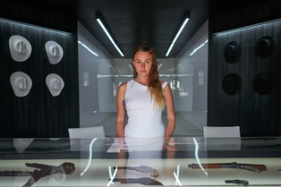

As you can see, these reference images offer scenes generally lacking in colour, with only really the skin tones prominent. They lean into a blue hue, but nothing too strong, as the key is to keep the scenes neutral and robotic.
Next, we have a couple of scenes set in a present day park during a winter's evening. The narrative in these scenes is all about warmth, family and connection with the here and now; it is important that the colour grade also reflects this. My research trail started with Kings of Summer (2013) and led me onto finding images for Moonrise Kingdom (2012), Her (2013) and Submarine (2010).


From these images, we have warm and sunny hues, with a low contrast and a grainy softness to the image. They look like ideal places to be, and this is also the case for the characters in this scene of the film.
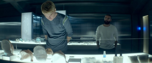
Then we move into the office facility of a faceless government organisation. There is a lot of tension, jeopardy and sadness in these scenes, so it is important that the colour grade also represents these emotions. Straight away my touchstone for this kind of tone is Mr Robot (TV series), one of my favourite all-time series about an emotionally devoid hacker trying to save the world by bringing down a greedy, evil corporation. This in itself takes inspiration from The Matrix (1999) and although I've not seen it, I found a great reference image from Terminator: Dark Fate (2019).


These images heavily move into a teal hue, known for its use to represent unease, uncertainty and tension. They are also quite dark, allowing the shadows to take a precedence, helping convey an air of foreboding. Each of the reference images show lifeless environments and this kind of tone will work well for these particular scenes in our film.
The last scene I needed to get references for was an interior 1940s location. When we think of this era, we think of sepia tones: warm, old, worn, but homely. Luckily, there's plenty of great films set around this time (don't know why), so I had lots of places to find reference images. Often war films are filmed outside across big battlescapes, but this scene in our film is set inside a cosy living room. The Imitation Game (2014), War Horse (2011), The Pianist (2002) and Darkest Hour (2017) all offered great stills for me to grab.


Providing a smokey, earthy quality with brown being the dominant tone, the grades here really help take you back to that time, as you're wrapped in a nostalgic blanket of colour.
Overall, this was just my first round of research, but I feel each of the above references offer a very strong foundation for me to work from when colour grading A Change in Time. Now I've done the research, I can't wait to get started.

Comments